WhiteCoat · Healthcare · 2025–2026
WhiteCoat was built for the single acute visit; chronic care needs a record that outlives it. I designed the programme end-to-end — patient app, doctor portal, ops CMS — in three phases, each making the next possible: OCR that structures scanned lab reports, trends that make ten readings comparable, and a custom-medication lifecycle for when inventory runs out.
Sole product designer across all three surfaces: from PRD reconciliation and cross-surface state mapping to QA-ready specs.
WhiteCoat · Singapore
Role
Sole Product Designer
Surfaces
Patient App · Doctor Portal · CMS
Timeline
Phase 1 (2025) · Phase 2 (2026)
Team
PM · Clinical Lead · Eng · QA · Ops

The centrepiece: an OCR-processed lab report — every extracted value structured, out-of-range results in red, and rule-triggered chronic disease tags awaiting a doctor’s Verify.
Many chronic patients in Singapore have no one regular doctor — and for years, WhiteCoat had no chronic pathway either. Patients with diabetes, hypertension, dyslipidaemia or thyroid disease booked acute consult after acute consult, with whichever GP came next.
The clearest symptom was the lab report. After every health screening, results arrived as a scanned PDF a doctor read by eye — data that could have flagged a chronic condition, locked in a format nothing could use.
CDM is the counter-design: one doctor who tracks your trend over time, medication supplied on a three-monthly cycle, blood drawn at home or in clinic — chronic care without the trip. I designed it end-to-end across the patient app, doctor portal and ops CMS.
None of this was speculative — the gap was visible in WhiteCoat’s own consult history. Nearly half of recurring-care patients were coming back again and again, 2.4 consults each on average, to manage conditions the platform had no programme for. The behaviour existed; the product didn’t.
Patients
No structured chronic care path
Re-explained their conditions at every consult. No dedicated routing to a specialist GP. No structured way to declare current medications before joining a queue.
Doctors
Lab reports read by eye, in a live consult
Lab results arrived as multi-page scanned PDFs, and doctors hunted for out-of-range values mid-consultation. Patient-declared conditions were indistinguishable from verified diagnoses, and there was no way to request medications outside standard inventory.
Operations
No workflow, just email
Custom medication procurement happened entirely over chat and email — no way to track a request from approval to delivery. This one arrived as an ops request: capture procurement details, supplier and cost context, and follow-ups in the CMS.
Chronic care doesn’t need a better consultation. It needs a record that survives between consultations.
Goals
A reliable data foundation
A patient-friendly intake
Continuity of care
Auditable operations
Success, as chartered: chronic-care context that exists in the system, and a workflow operations can run at scale.
The sequence wasn’t a preference, it was a dependency chain. You cannot chart a trend before the data underneath it is structured, and a custom-medication workflow only earns its complexity once there is a chronic cohort being treated for life. Each phase existed to make the next one possible. That is also the documented shape of it: a foundational data charter in May 2025, the Phase 1 OCR-and-tagging build, then the Phase 2 chronic-care and custom-medication workflow in May 2026.
Phase 1
Make the data legible
A PDF is a picture of data — nothing can reason over it. Extraction turns a scanned report into structured values with a visible source per row.
Phase 2
Make it tell time
One lab value is a snapshot. A chronic condition only becomes visible across ten of them, in the same units, in order.
Phase 3
Handle the exceptions
Once you treat someone indefinitely, standard inventory stops being enough — and a non-standard medication is a supply-chain problem wearing a prescription’s clothes.
Part 1
How do you show a machine’s guess to a clinician without that guess becoming a fact?
The centrepiece of the programme: patients upload their lab reports during pre-consult intake, an OCR pipeline extracts every test value, and clinical threshold rules flag which chronic conditions the results suggest — as unverified tags the doctor reviews, confirms, or dismisses.
Early concept · redrawn — not final UI

The pipeline as it was first conceived, before any screen existed — redrawn for this page. The decisions that mattered were already here: a source per extracted row, rules the clinical team writes, and a tag that stays a suggestion until a person acts.
1
Patient uploads
Lab reports as PDF or photos, during pre-consult intake.

One upload feeds everything
It starts with the patient: lab results uploaded as PDF or photos during pre-consult intake. This single optional step is the entry point for the entire pipeline: every extracted value, every suggested tag, every longitudinal chart traces back to this screen.
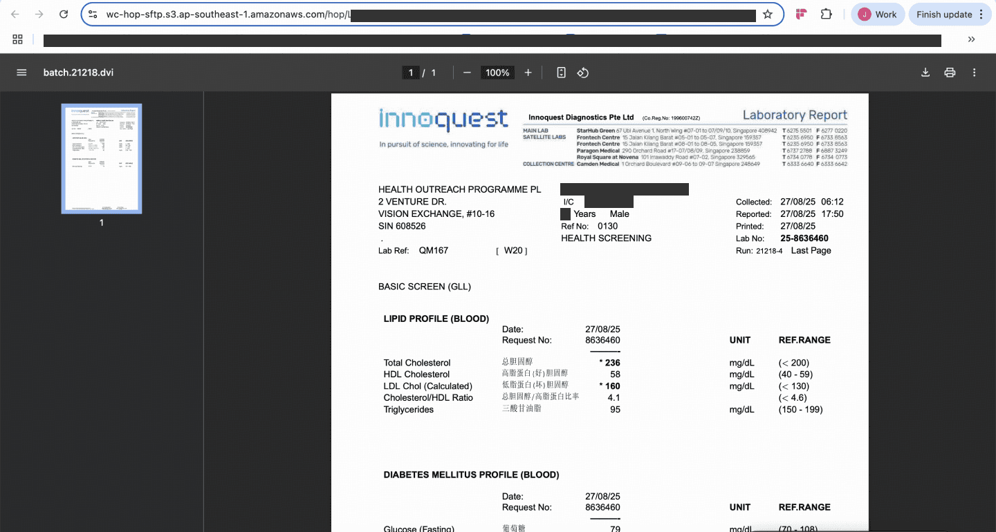
The ground truth stays one click away
“View Original Report” opens the scanned source document exactly as the lab issued it. Extracted data never replaces the ground truth; it sits beside it, so a doctor can always audit what the OCR read against what the paper says.
Why rules, not a black box
Every suggested condition shows exactly why it fired, with the patient’s own values in the sentence: “Diabetes Type 2 — Triggered by: HbA1c ≥ 6.5% (7.2%) + Fasting Glucose ≥ 126 mg/dL.” Detection is deliberately deterministic: clinical threshold rules the medical team can review and sign off, not an opaque model score. The AI does the reading; the rules do the flagging; the doctor does the diagnosing.
Designed to fail safely
OCR not processed is a designed branch, not an error toast — the report stays readable and the doctor works from the original
Edit Results Manually lets clinical staff correct any extraction before it can trigger a tag
Unverified by default — no tag touches the patient’s record until a doctor acts on it, and confirmed diagnoses need admin access to reverse
“Is this a critical condition?” is a separate, explicit doctor decision — criticality is never inferred
False alarms have to be easy to throw away
Rules fire on numbers, and numbers sometimes have innocent explanations — a result can cross a threshold without the patient having the condition. So a doctor can delete a suggested tag as easily as verify one. If clearing a false alarm took effort, doctors would soon stop reading the suggestions at all — and a warning nobody reads is worse than no warning.
Impossible to mistake for a diagnosis
Tags arrive red and “Unverified · Critical”. The visual state does the clinical-safety work. Until a doctor acts, a suggestion can never be read as a confirmed diagnosis.

Confirmation is two deliberate steps
In-consult confirmation is “Select Diagnosis”, then “Confirm Chronic Diagnosis”: two intentional actions, so suggestions stay prompts and never become auto-diagnoses.
The principle
First application: a rule-triggered tag arrives red and explicitly marked unverified. It cannot be mistaken for a confirmed diagnosis, because the visual state is doing the clinical-safety work — not a tooltip, and not the reader’s care.
Patients declare their conditions at intake; the pipeline suggests tags from lab evidence. The record never blends the two: patient-reported conditions carry an “(unverified)” label in the Doctor Portal until a doctor confirms the diagnosis in consultation, and every tag’s lineage stays auditable.
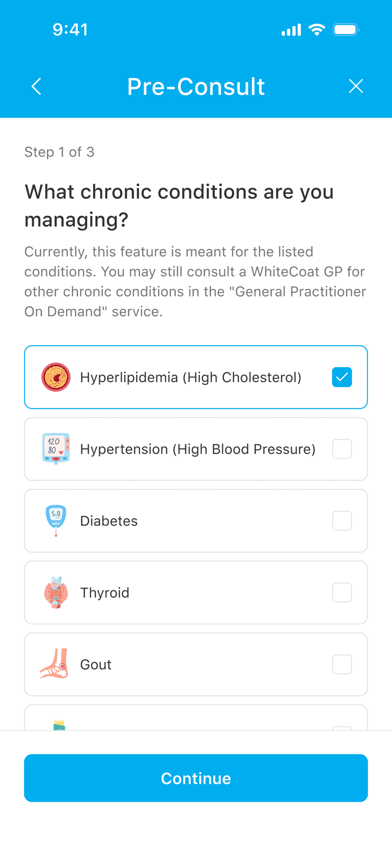
Honest about what it doesn’t cover
Intake lists the seven conditions the programme supports — the same seven the detection rules cover — and says plainly what happens if yours isn’t one of them: you’re still seen, just through general practice rather than this pathway.

Declared and verified, side by side
The patient-level chronic record keeps “Patient Declared Conditions” and “Chronic Disease Result Tags” as separate lists, with the uploaded lab files beneath. The lineage of every tag stays auditable, and self-report never masquerades as diagnosis.
Doctors prescribe follow-up tests (“repeat HbA1c in 3 months”), the app surfaces them with a purchase validity window and a payment countdown, patients book an at-home blood draw, and the results flow back into the same OCR pipeline that started the journey.

Prescribed-test payment: itemised panel, corporate benefits applied, and a countdown because the system verifies a doctor actually prescribed this test.

At-home health screening booking: five steps from confirmation code to appointment slot. The blood draw comes to the patient; the results come back to the doctor.
Part 2
A chronic condition is invisible in a single lab report. So what is the smallest thing that makes it visible?
That is the whole premise of a chronic programme. Diabetes doesn’t announce itself in a single HbA1c; it shows up as drift across years. Before this phase, a doctor comparing readings was opening scanned PDFs side by side and holding the numbers in their head. Once extraction made every value structured and comparable, the trend view became possible — per panel, in consistent units, most recent first.
Early concept · redrawn — not final UI

The trend as it was first sketched — redrawn for this page: one folder per chronic panel, opening into analytes against the latest ten screening dates. The deliberate choice is visible in the empty cells: a table of values that keeps its gaps, rather than a chart that smooths them away.

Ten screenings, one row per analyte
Each chronic panel — Diabetes Mellitus, Lipid Profile, Renal Panel — gets its own trend across the latest ten screening dates, one row per analyte with its unit stated once. The doctor reads left to right for direction rather than opening ten reports to reconstruct it.
Real longitudinal data is patchy
A trend view is easy to design when every cell is populated. Actual patient histories aren’t: panels get ordered selectively, patients skip screenings, and older records predate the programme. The table has to stay readable when a series is incomplete rather than implying a clean line through gaps — which is also why this stayed a table of values instead of becoming a smoothed chart.
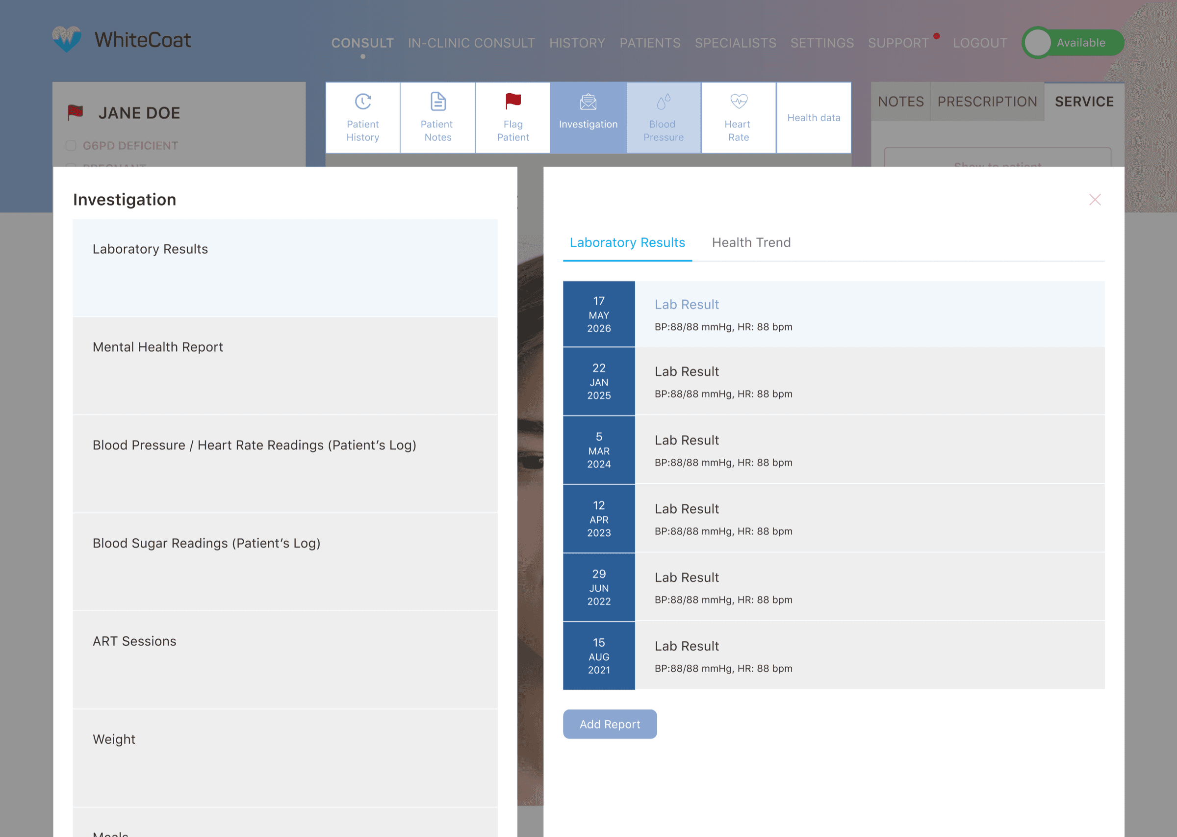
Five years of labs, one scrollable view
Every processed report joins a longitudinal timeline: five years of lab history in a single view, instead of a folder of scanned PDFs opened one by one.

Each test opens into its own history
The Health Trend tab lists every panel — Diabetes Mellitus, Lipid Profile, Renal Panel — and clicking one opens that test’s individual trend. Panels without enough results say so plainly: “No Eligible Data”.
Part 3
A request crosses three teams over days and ends at a patient. How does it never once read as a prescription?
Early concept · redrawn — not final UI
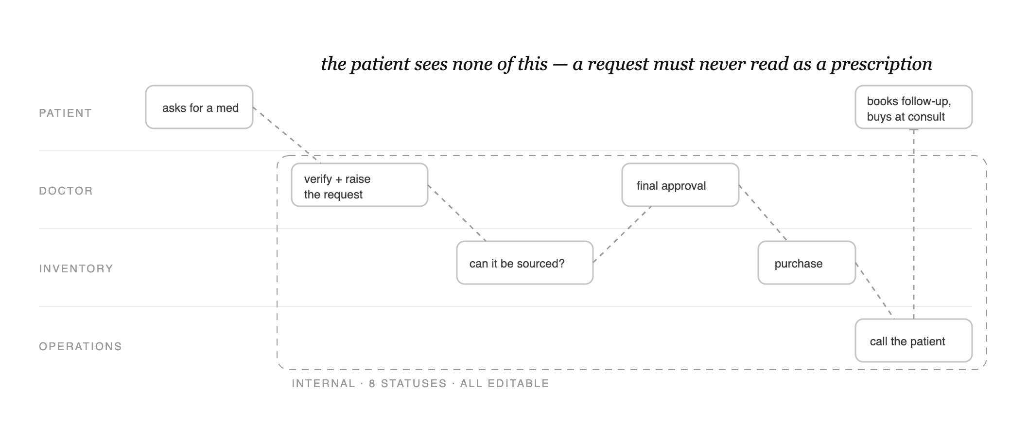
The handoff as it was first mapped — redrawn for this page: three teams passing one case, the eight editable statuses fenced inside a dashed wall, and the patient touching the flow only at its two ends. The terminology guide below exists to police that wall.
It isn’t a prescription. It isn’t a purchase. But nothing on screen said so. The same request had to mean something different to each of the three users.
The patient
Sees nothing until it’s real
Hidden across all seven patient screens until fulfilled, so it can never pass as a prescription.
The doctor
Sees it labelled
Patient-declared conditions always tagged “unverified”, never mistaken for a diagnosis.
Operations
Sees everything
The only full view: all eight lifecycle stages, editable at each step.
The hard work here wasn’t visual: it was deciding what to show, what to hide, and who can move a case forward. Two decisions shaped the whole workflow.
01
Patient visibility
Hide custom medication request states from patients entirely
A custom medication request is not a prescription and not a purchase. If patients see it as “pending” in their medication list, they might delay seeking care elsewhere if procurement falls through. Decision: completely invisible across all patient-facing surfaces until fulfilled, requiring explicit filtering across 7+ endpoints.
02
Operational workflow
8-status CMS case management — editable at every stage
Procurement passes between three teams: medical, inventory, and operations. I designed an 8-status workflow tracking every handoff. Early specs proposed locking terminal states; this was removed. Phase 2 is a first release; ops teams need flexibility to correct errors without rigid workflow gates.
1
Patient
Asks for a custom medication
During the consult, the patient requests a medication that isn’t in standard inventory.
2
Doctor
Verifies and raises the request
The doctor confirms it’s clinically appropriate and submits it to the inventory team.
3
Inventory
Confirms it can be sourced
Inventory checks availability and approves: the medication can be procured.
4
Doctor
Gives final approval
With inventory confirmed, the doctor signs off. This is the happy path.
5
Inventory
Purchases the medication
Inventory procures the approved medication and marks it ready.
6
Operations
Calls the patient to complete it
Once it’s ready, operations contacts the patient to book a follow-up GP consult and purchase the medication.
Behind the scenes, the CMS tracks this handoff as an 8-status lifecycle, with every stage editable so operations can correct a case without rigid gates.

Where the request starts
The consult workspace with a Chronic Care Programme badge and patient-uploaded medication photos. The doctor switches to Medication Request mode and searches the NEHR drug list; the standard prescription flow stays untouched.

Where inventory picks it up
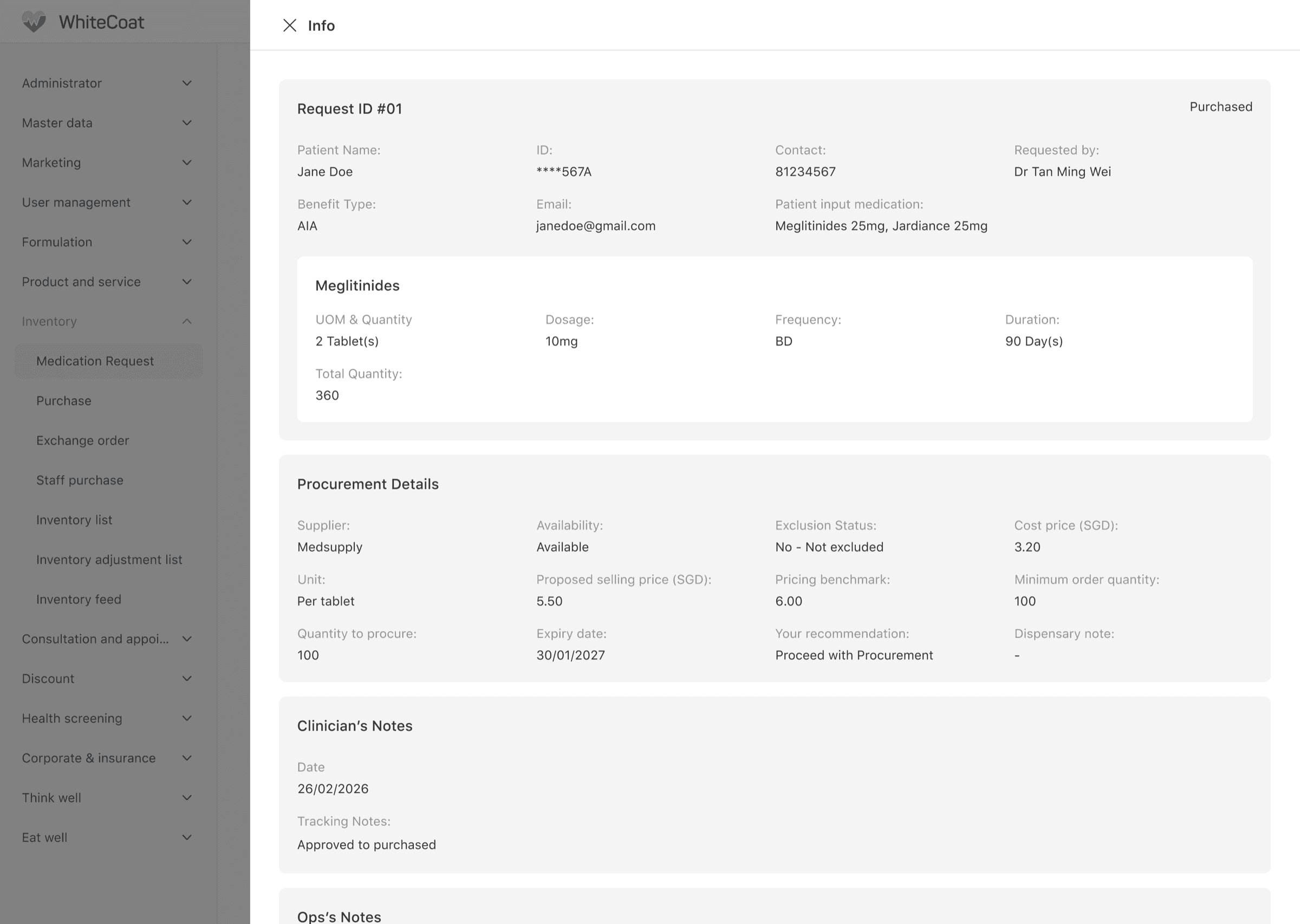
One queue in the CMS: each case carries the patient, the requested item, a procurement recommendation and its lifecycle status. A case leaves the doctor and appears here — nothing re-typed into a message thread.
Where the request lives
A medication request case in CMS: patient-declared meds beside the doctor’s requested item with dosage, frequency, and lifecycle status, so every team works from the same record.
Review and advise — never supply
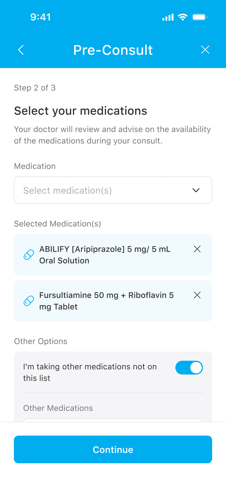
Everything above is internal; the patient’s visible share is this screen at intake, and a call from operations when the medication is ready. The promise is worded precisely — the doctor “will review and advise on the availability” — and nothing on the patient’s side ever implies a medicine is secured.
The same principle, a second time
Second application: a medication request is not a prescription, and a patient who believes otherwise will expect a medicine that may never arrive. So the vocabulary itself became the deliverable — a terminology guide separating request, approved, procured, purchased and dispensed, each state defined by what it is allowed to show the patient. Two unrelated features, one failure mode, one answer.
Five words, five different promises
The terminology guide’s job, in one table: each state, what it means, and what it is allowed to show the patient.
Request
The doctor has asked for a medication to be sourced. Nothing is prescribed; nothing is bought.
Approved
Clinically appropriate, confirmed sourceable, signed off.
Procured
Inventory has secured it from the supplier.
Purchased
Stock bought and ready.
Dispensed
Bought and collected by the patient at that consult.
The design challenge was making three separate products — a mobile patient app, a web-based doctor portal, and an ops CMS — feel like a single programme of care. Every decision in one surface had consequences for the others.
Patient App — conditions
The patient declares their chronic conditions at intake — the same seven the detection rules cover.
Patient App — medications
They list the medications they’re on; the doctor reviews availability in consult — advised, never promised.
Doctor Portal
Rule-triggered tags are verified beside the lab evidence, live in consult.
CMS
The medication request lives here, shared by medical, inventory and operations.
Look closely and it is the same patient throughout: what she declares in the app is what her doctor verifies in the portal, and what operations fulfil in the CMS. One record, three surfaces, four views.
Patient App
Structured intake, before the queue
Patients declare their conditions and current medications, upload lab reports, and consent, all before joining the queue, so the doctor starts the consult with context instead of questions.
Doctor Portal
One workspace, two modes
Intake context and lab evidence beside the consult. Standard prescriptions work exactly as before; Medication Request mode searches the NEHR drug list when standard inventory isn’t enough.
CMS
Where operations runs the case
A filterable request queue and a case detail view carrying procurement context; the 8-status lifecycle stays editable at every stage, because a first release needs flexibility, not locked gates.
Queue routing: shortest wait wins
Chronic patients are typically older and less likely to wait through a long queue. The programme routes them to the shortest-queue CDM doctor rather than in-house priority, the most patient-centric default for this group.
Two months in, the data talks back
The intake flow shipped instrumented, and it now has two months of live data. Figures are kept relative — the absolute counts are WhiteCoat’s, not mine to publish.
2.4
consults per returning chronic patient
4 in 5
patients are under 45
20 : 1
entries via the GP flow vs the tile
1 in 4
tile visitors complete the flow
That last number names the next design move. The steepest loss sits at the disclaimer and get-started screens — the flow asks for agreement before it has shown any value. My first hypothesis to test: lead with what the programme covers, and ask for consent at the point of commitment rather than at the doorway.
Happy-path review misses the states that matter most
I discovered several critical app states (the GP redirect disclaimer, the drug-allergies screen, the post-consult visibility check) through a screenshot-backed copy review, not normal design review. I now treat artifact-building as a design completeness check in every project.
Precise language is clinical safety
Using “prescription” or “purchased” for a medication request would have misled patients, doctors, and ops. I built a terminology guide distinguishing request / approved / procured / purchased / dispensed, each with different patient-visibility implications.
Frontend tickets can’t imply backend contracts
Several UI stories described behaviour (queue routing, patient-safe payload filtering, idempotent end-call case creation) without those backend contracts being formally defined. A UI design that relies on an undefined backend contract is not a complete design.